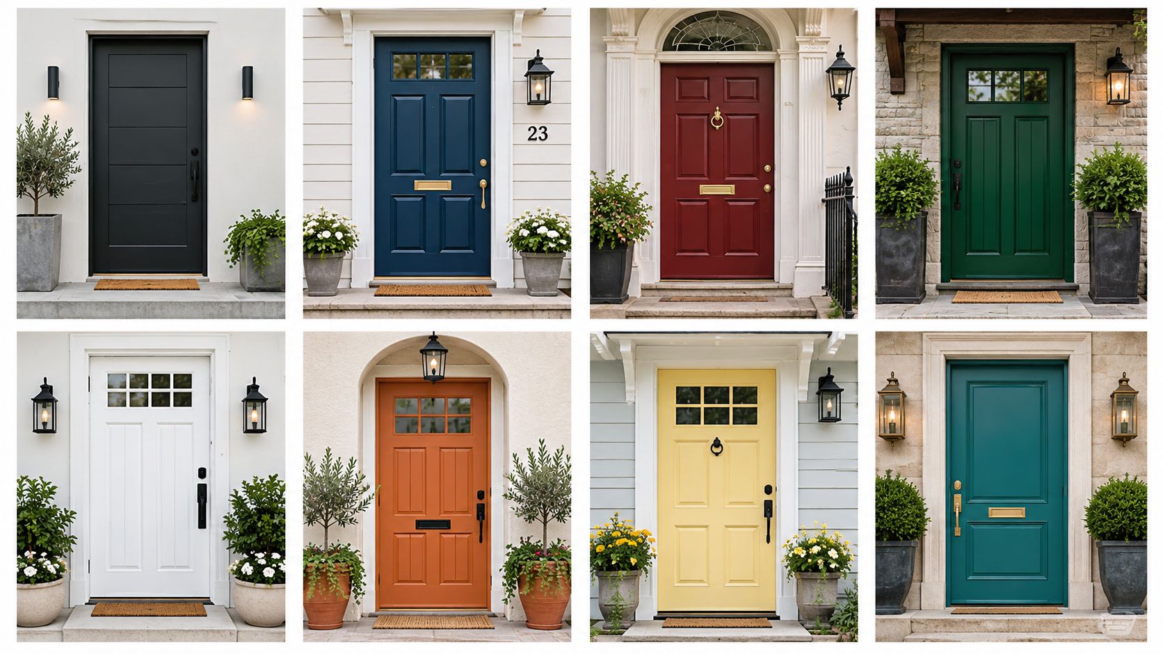
The best colour for front door paint is one that works with your home's brick or siding, trim, light, and hardware, not just a paint chip. Black and charcoal offer contrast; navy and burgundy suit traditional entries; sage and forest green connect with natural materials; white brightens; and terracotta suits warm-toned exteriors. Test large samples on the door in sun and shade before you commit.
Coordinate warmth across the property
Build the entrance around the green
Choose the charcoal by undertone
Use the landscape as part of the colour decision
Match navy to the surrounding palette
Table of Contents
- 1. Classic Black
- 2. Deep Navy Blue
- 3. Warm Sage Green
- 4. Charcoal Gray
- 5. Rich Burgundy or Wine Red
- 6. Bright White or Off-White
- 7. Deep Forest Green
- 8. Warm Terracotta or Rust
- 8-Color Front Door Comparison
- Turn a Colour Idea Into a Confident Choice
1. Classic Black
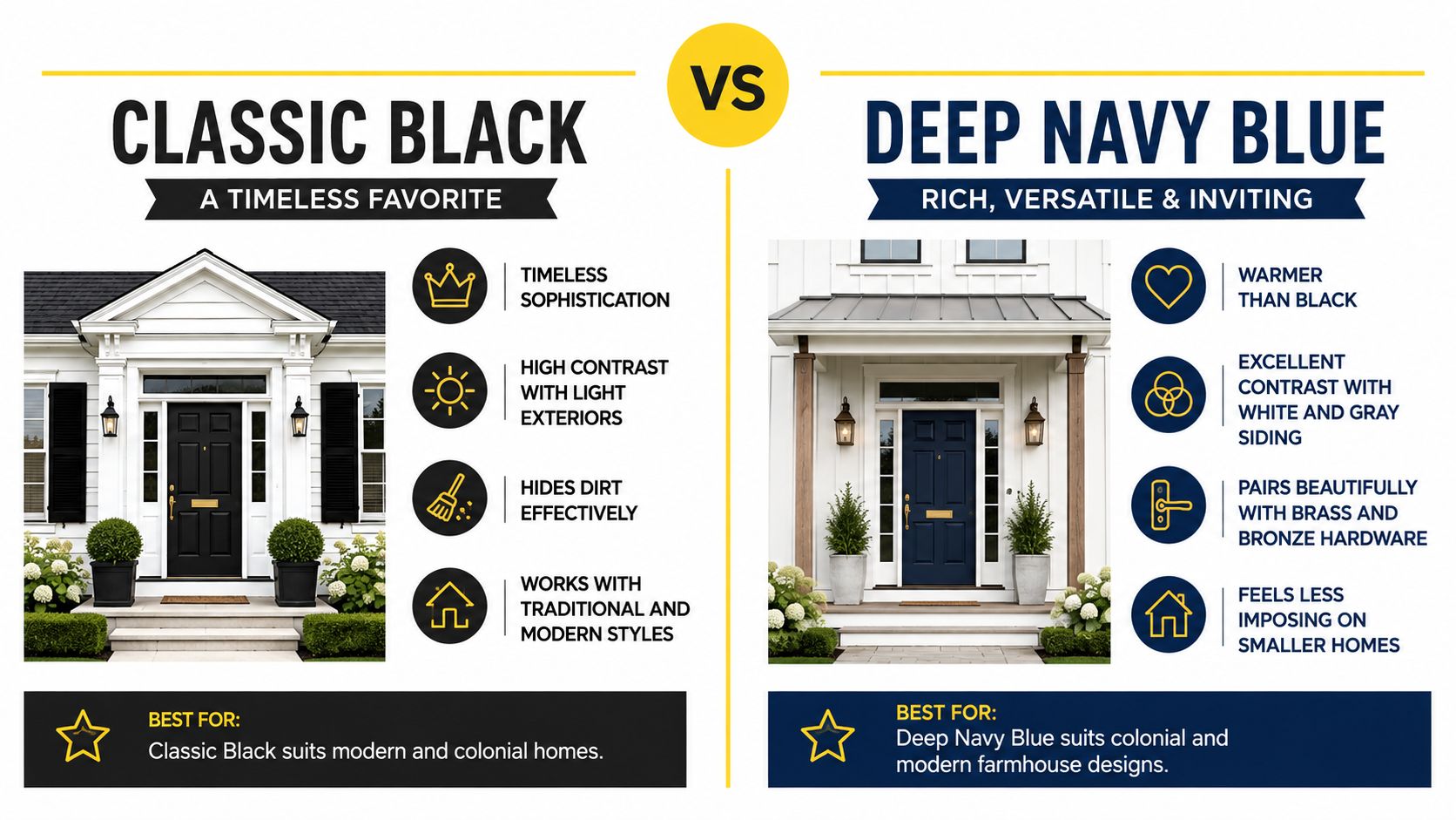
Black gives light siding, cream stone, and red brick a crisp focal point. It suits traditional homes, modern townhouses, and commercial entrances. Brass or bronze warms it up; stainless steel keeps it contemporary.
Angi and CCR market data reported by Yahoo Lifestyle identifies black as the most popular front-door colour in 17 U.S. states. The article also cites buyer-perception research suggesting some prospective buyers would pay about $6,449 more for a home with a black door. Neither finding predicts Toronto sale prices.
Where black works best
Light exteriors: Strong contrast helps define the entry.
Detailed façades: Panels, sidelights, and trim frame the dark colour.
High-traffic properties: Its restrained look coordinates with varied exterior details.
Direct sun can heat a dark door. Check the door material and exposure, then choose a suitable exterior coating. Clean, repair, sand, and prime as needed before painting. For detailed trim or a damaged surface, see Soca Services Painting's painting services for trim and doors.
Repeat black in a light fixture or house numbers so the door feels connected to the façade.
2. Deep Navy Blue
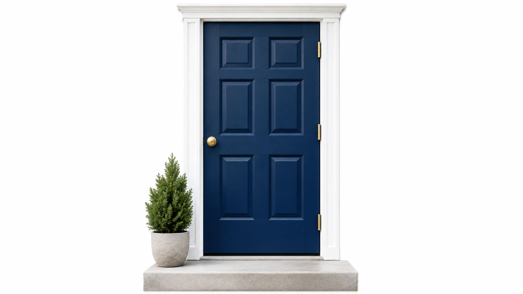
Navy offers much of black's formality with a softer feel. Try it with white trim, cream siding, pale stone, or brick. Brass and bronze give it a traditional look; stainless steel and matte black feel more contemporary.
Match navy to the surrounding palette
A cool navy may suit grey siding but look purple beside beige. A warmer navy can sit more comfortably with cream, tan, or red brick. Test a large sample at the entrance rather than judging it against a white card.
Magic Window's Ontario front-door colour guidance recommends checking samples in morning, noon, and evening light. It also recommends 100% acrylic exterior paint with UV protection and a satin or semi-gloss finish. Satin offers some depth without emphasizing every surface flaw.
For a wider range of accents, browse these colourful front-door ideas.
3. Warm Sage Green
Muted sage suits brick, stone, wood, cedar, and established gardens. It can bring colour to a cottage, farmhouse, or older Toronto home without dominating the façade.
Use the landscape as part of the colour decision
Compare sage with the home's fixed materials and planting. A grey-blue sage can look dull against warm brick; a yellow-leaning one may become too bright in afternoon sun. BMR's front-door colour guidance likewise recommends considering fixed elements such as siding, roofing, and windows.
Bronze or matte black hardware grounds the colour. Make sure the door contrasts enough with nearby trim and siding to remain visible from the street. Check the sample in sun and under the porch roof, where it may look quite different.
4. Charcoal Gray
Charcoal softens black's contrast while giving modern siding, concrete, and stone a defined entry. Its undertone matters: warm charcoal suits cream, wood, and many brick exteriors; cooler versions sit better with blue-grey siding and crisp white trim.
Choose the charcoal by undertone
Hold large samples beside the door casing as well as the siding. A charcoal door can disappear against dark cladding or a deeply shaded porch, while an unwanted blue or green undertone may clash with masonry.
Brushed metal and matte black hardware keep the look simple. Before painting, smooth repairs carefully: dark neutral finishes can reveal dents, patching, and uneven sheen in angled light.
5. Rich Burgundy or Wine Red
Burgundy adds warmth to traditional, Colonial, and heritage-inspired entrances, particularly with brick, stone, cream trim, and panelled doors. Brass and bronze reinforce that classic look.
Keep the red deep, not loud
Test burgundy beside the actual masonry and trim. It can read brown in shade or purple beside cool grey. A deep red usually fits a detailed entrance more naturally than a stark, minimal façade.
Saturated colour draws attention to scratches and failing paint. Repair and prime the surface as needed, then choose an exterior product suited to the door's exposure. Judge the colour across the whole entry, not in isolation.
6. Bright White or Off-White
White can make an entry feel open, provided the door doesn't disappear into matching siding and trim. Dark hardware, a contrasting casing, or a wood porch can give it definition. Off-white often pairs more comfortably with warm brick, stone, and cream trim than stark white.
Plan for visible wear
White shows fingerprints, scuffs, and uneven touch-ups. Choose a cleanable exterior finish and expect more frequent maintenance on a busy entrance. Smooth repairs and neat caulking matter because white does little to hide defects.
Dulux Canada's exterior colour guidance recommends coordinating the door with shutters and other exterior details. If you're choosing more than one paint colour, Soca Services Painting's exterior paint colour combinations can help you assess the full façade.
7. Deep Forest Green
Forest green gives brick, stone, and wood a grounded focal point. It fits traditional homes and properties with mature trees or gardens. Antique brass, bronze, copper, and natural wood complement it; matte black creates sharper contrast.
Build the entrance around the green
Sample forest green in direct sun and under the porch roof. In shade, it may look nearly black. Compare it with brick, trim, railings, and planters so the colour belongs to the entry rather than standing apart.
Clean and repair the door before painting, and confirm the primer and topcoat suit its material and exposure. Soca Services Painting's Benjamin Moore exterior paint guide is a starting point for product planning.
8. Warm Terracotta or Rust
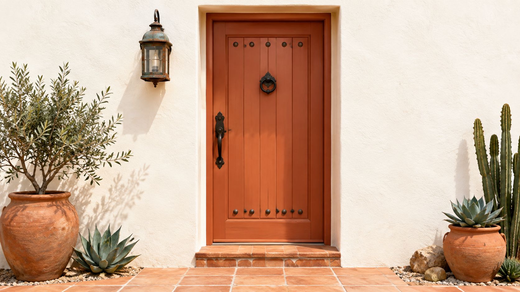
Terracotta and rust work best with stucco, clay-toned brick, natural wood, and warm stone. They can suit Mediterranean, Spanish Colonial, and rustic homes but may look disconnected from cool grey siding or metal cladding.
Coordinate warmth across the property
Look for existing ochre, copper, beige, or earth tones. Wrought iron, aged bronze, and dark wood can reinforce the palette; cool chrome may make the door look more orange. Test the sample in sun and shade, and choose an exterior coating suited to its exposure.
Check for failed caulking, moisture damage, and loose paint before starting. For the preparation and application steps, see Soca Services Painting's guide to painting an exterior door.
8-Color Front Door Comparison
| Door colour | Best fit | Check before painting |
|---|---|---|
| Black | Light exteriors; traditional or modern entries | Heat and direct-sun exposure |
| Navy | Brick, cream siding, white trim | Blue or purple undertones |
| Sage | Wood, stone, brick, gardens | Contrast and warm versus cool undertones |
| Charcoal | Contemporary siding, concrete, mixed materials | Contrast in a shaded entry |
| Burgundy | Traditional brick or stone homes | Brown or purple shifts in changing light |
| White or off-white | Cottage, minimal, or contrasting exteriors | Visible wear and insufficient contrast |
| Forest green | Brick, stone, mature landscaping | Whether shade makes it look black |
| Terracotta or rust | Stucco, clay, and warm masonry | Fit with fixed exterior colours |
Turn a Colour Idea Into a Confident Choice
Narrow your choices to two or three colours that suit the home's architecture. Then:
Compare fixed materials. Check each sample against brick, siding, trim, windows, and stone.
Test real light. View a large sample on the door or a movable board in morning and evening light, sun, and shade.
Check the details. Make sure the hardware, lighting, and landscaping support the choice.
Plan the finish and prep. Select a coating suited to the door and its exposure; repair damage before painting.
Check local requirements. If the property is designated or in a heritage conservation area, confirm any applicable colour rules before buying paint.
Colour selection can feel harder than the painting itself. A 2025 Canadian homeowner survey found 78% would consider changing their home's exterior colour, while 48% felt there were too many factors to weigh. In a separate 2024 survey of 1,032 Canadian homeowners, 55% named colour selection their biggest hurdle, according to Behr Canada's curb-appeal guidance. Large, in-place samples make the choice more concrete.
For rentals, commercial properties, or homes being prepared for sale, black, charcoal, and navy may be easier to coordinate with changing exterior details. More distinctive colours work when the building's materials support them.
Soca Services Painting provides front-door painting, preparation, and colour guidance in Toronto and the GTA. Visit Soca Services Painting to discuss the project or request an estimate.